Combining PowerBI and Claude Code can help to speed up report development. I’ve recorded a 4 part mini-series to demonstrate the usage of Claude Code in report project. This is not about vibe coding reports, but to delegate boring coding and modeling tasks.
Part 1: Use PowerBI Project Files with Claude Code in VSCode, create the initial Claude.md file and let Claude generate a source database documentation:
Part 2: Use Claude Code to modify the data model. Generate a date dimension table and use the planning mode:
Part 3: Create a reusable skill for a date dimension table and test it in another report
Part 4: Generate DAX Measures from requiremet prompt to summarize the Totals and Year-by-year comparison without telling Claude Code which formulars to use:
PowerBI is great for data analysis and visualization. It also supports What-If simulations, but lacks the ability to save analysis results in a structured way. In combination with Fabric User Data Functions you can implement a simple Write-Back to a data source in Fabric (e.g. database, lakehouse).
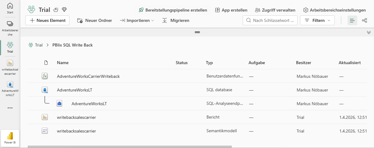
I’ve implemented a small demo application in Fabric. The workspace contains a SQL database, a User Data Function and a PowerBI report.
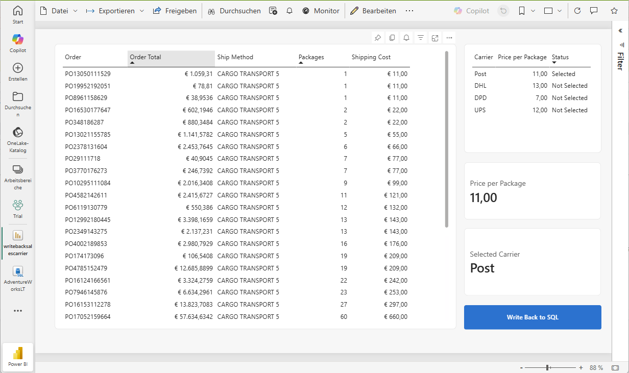
The database holds an Adventure Works demo dataset. It contains two additional tables (Carrier and CarrierSelected). The Carrier tables hols package delivery providers and the price for a package to be delivered. The CarrierSelected has only 1 record with the selected carrier.
Carrier
PricePerQty
UPS
12
DHL
13
DPD
7
Post
11
PowerBI creates a table that flags the selected carrier. I’m using two measures to get the actual selected carrier and price. If nothing is seleced, the price is from the record flagged as selected, otherwise the selected (aka. clicked) record in the table visual.
Active Carrier =
VAR SelectedCarrier = SELECTEDVALUE(Carrier[Carrier])
The actual price is used to calculate the shipping costs by multiplying the SalesOrderDetails.Qty with the package price. Selecting a different carrier immediately updates the price.
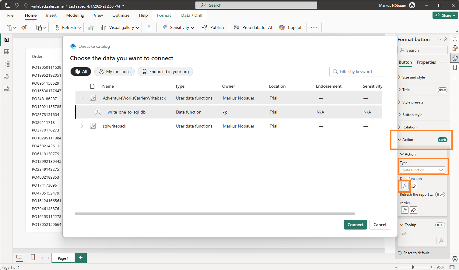
The magic happens when clicking on the “Write back to SQL” button. This is a blank button with the Action enabled and a linked data function. It takes the value from the “Active Carrier” measure and passes it as parameter to the data function.
The User Data Function is an artifact in the Fabric workspace. It can uses connections to data sources in fabric. In my case it connects to the SQL database. The function has a string input parameter “carrier”. The code deletes the existing entry in the CarrierSelection table and inserts the new one.
Load Dynamics 365 F/SCM in Synapse and visualize in PowerBI
Synapse link for Dataverse is the replacement for Export to Datalake which has been deprecated in 2023. Although it is called link for Dataverse, it can be used to access Dynamics 365 Finance and Supply Chain tables (and CE data from dataverse as well).
SQL Track Changes has to be enabled in D365 F/SCM. Creates, Updates and Deletes are written to a storage account in CSV format. Synapse is running a spark pool that converts the CSVs into Deltalake format which relies on the (Open-Standard) Parquet format. As result you can see and query the F/SCM tables in the lake like it were tables in a relational database.
Good news, Synpase has a serverless SQL pool and a public SQL endpoint. You can find the SQL endpoint from the Manage Icon (down left) > SQL Pools > Select your pool > Workspace SQL Endpoint.
You can create databases in this SQL pool and create views based on the tables in the datalake. For example join CustTable and DirPartyTable and provide a view that contains customer data with a name and address.
You can use the development workspace in Synapse web based workspace but you could also use other tools to connect e.g. SQL Server Management Studio. Tables in the datalake and views in another database can be accessed.
PowerBI has a built-in connector for Synapse Workspace. You can easily load data from the tables and also from the views.
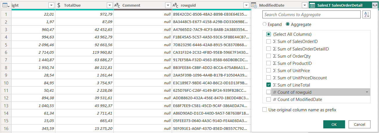
Aggregating values from a related table is a common task in PowerBI. However, there are many ways how to achieve this goal. Here are a few examples:
Note: I'm using an Adventure Works Lite Demo DB and using SalesOrderHeader + SalesOrderDetail to aggregate the LineAmount from the details.
1) Aggregate at data source
If you have the option to push aggregation logic to the data source you should do so. Especially if the data source is SQL Server because its designed to execute queries and perform aggregations in a very effective way.
select h.SalesOrderID, sum(d.LineTotal) as SumLineTotals
from SalesLT.SalesOrderHeader as h
left outer join SalesLT.SalesOrderDetail as d
on h.SalesOrderID = d.SalesOrderID
group by h.SalesOrderID
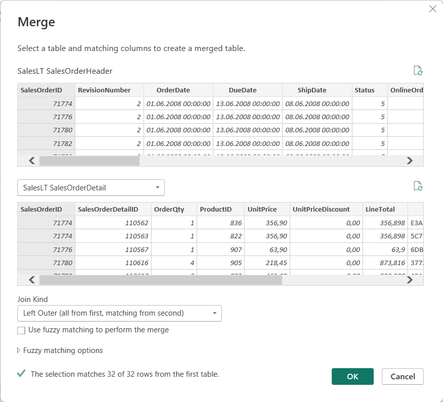
2) Join in Power Query
Load both tables using PowerQuery. Select the SalesOrderHeader table. From Home tab, select Merge Queries. Join both tables via SalesOrderID and select LEFT OUTER JOIN as join type.
Navigate the joined table but select Aggregate instead of Expand. Aggregate the LineTotals from the SalesOrderDetails.
3) Calculated Column in Power Query (M)
You can also use PowerQuery to sum up values from another table. Note “Rename” is the name of the prev. Step in my PowerQuery.
= Table.AddColumn(Rename, "LineTotalsPQ",
each let no = [SalesOrderID]
in List.Sum(
Table.SelectRows(#"SalesLT SalesOrderDetail", each [SalesOrderID] = no)[LineTotal]
))
4) Calculated Column in Data Model (DAX)
Create a new column at the SalesOrderHeader in the data model using SUMX function.
Make sure you have an active 1:n relation from SalesOrderHeader to SalesOrderDetails via SalesOrderID. Create a new measure on the SalesOrderHeader using DAX.
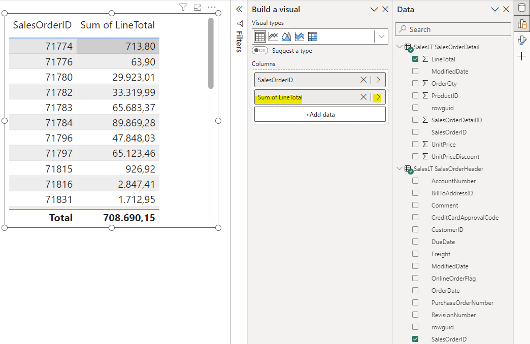
Add a table visual to the report and place the SalesOrderID and the measure from the SalesOrderHeader table.
6) Visual
Make sure you have an active 1:n relation from SalesOrderHeader to SalesOrderDetails via SalesOrderID. Add a table visual and place the SalesOrderID from the SalesOrderHeader table. Add the LineAmount from the SalesOrderLines and choose to aggregate as Sum.
When working on PowerBI projects for a longer time or supporting a customer, version control would be a desireable feature. In many cases PowerBI files are stored on file share or SharePoint. At this moment (August 2023) there is no integrated version control feature in PowerBI Desktop. But we can use featues from different software products to build a version control strategy for PowerBI.
There is a preview feature call “Save as PowerBI project” in PowerBI Desktop. This will split the PowerBI report into multiple files that contain the model definition, the report layout and some more files. Now that we have multiple files in a project folder, one can come up with the idea to put these files under a version control system.
You can use Git as version control system on your local PC or wherever the PowerBI reports are developed. Git has a local repository and can be connected to central repository. In Azure DevOps you can setup projects using Git as version control system. Connect your local PowerBI Git repository with Azure DevOps to manage your PowerBI report development.
PowerBI supports training machine learning models like classification and regression in PowerBI Online. In preparation for a webcast I’ve recorded the training of regression model to predict mean-time-to-failure. Watch the step-by-step guide in my ERPCoder Youtube Channel
Dynamics 365 Finance and Supply Chain Management uses SQL Server Reporting Services for reporting and document generation. In 2022 Microsoft included SSRS (aka. Paginated Reports) in PowerBI Pro license. One may ask if it is possible to use PowerBI Paginated Reports as well for reporting purpose in Dynamics 365 F/SCM.
X++ SSRS
PowerBI Paginated Reports
+ Direct access to transaction DB + Business logic in X++ + Integrated with Dynamics 365 FO
– Complex development – Embedded in Dynamics 365 FO deployment cycle
+ Simple development using Report Builder + Integrated with Business Intelligence + Reuse existing data models
– Limited development possibilities – No direct data access
Pros and Cons for Paginated Reports
Side-to-side comparison SSRS X++ report vs. PowerBI Paginated Report
Data Access
Paginated reports in PowerBI have only a limited capability to access data. There is no Dynamics 365 FO connector or OData access to entities. You could use different approaches to get Dynamics 365 FO data.
PowerBI dataset. The report builder can access PowerBI datasets. If you don’t have real time requirements for the paginated reports, this may be the preferred approach. Use the ETL functionality in Power Query to prepare the dataset or use an existing one.
Development
Paginated reports are designed by using the Report Builder. It is an adapted version of the SSRS Report Builder with some more data access features. In theory you could develop an SSRS report using Visual Studio and upload the .RDL file. However, PowerBI Paginated Reports are a limited version of SSRS and you might get errors.
Fazit
Paginated Reports are a reduced SSRS feature in PowerBI. The Report Builder is very limited. You can define data access, defined parameters and place data on the report sheet. If you want to create printable documents without real-time requirement the Paginated Reports may be an option for you.
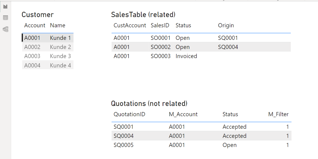
In some cases you want to filter a table based on a selection which is not related to the table. For example the SalesTable is realted to the CustTable via the Account. The QuotationTable is related to the SalesTable (QuotationID -> Origin). The QuotationTable also has an Account field but is not related to the CustTable.
Such a situation can be avoided by using a better design approach, however you may come across such a problem one day 😉
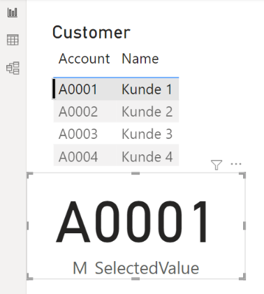
Compare SelectedValue
Create a new measure in the CustTable that returns the selected value. Place a table visual showing the CustTable in the report. For debugging reasons you may want to place a card visual with your measure as well.
Add a second measure to compare the selected CustTable value to the CustAccount value in the Quotation table and returns a numeric value (not a boolean). If there is no CustTable selected return e.g. 2, if the selected values are equal return 1, else return 0.
A recent requirement at a customer was to compare Sales Quantity and Sales Totals of different time spans in one matrix. The customer is selling saisonal as well as all-time products. It should be possible to compare the sale of saisonal products from last season to the actual sales.
Sum of different time spans and product
Data Model
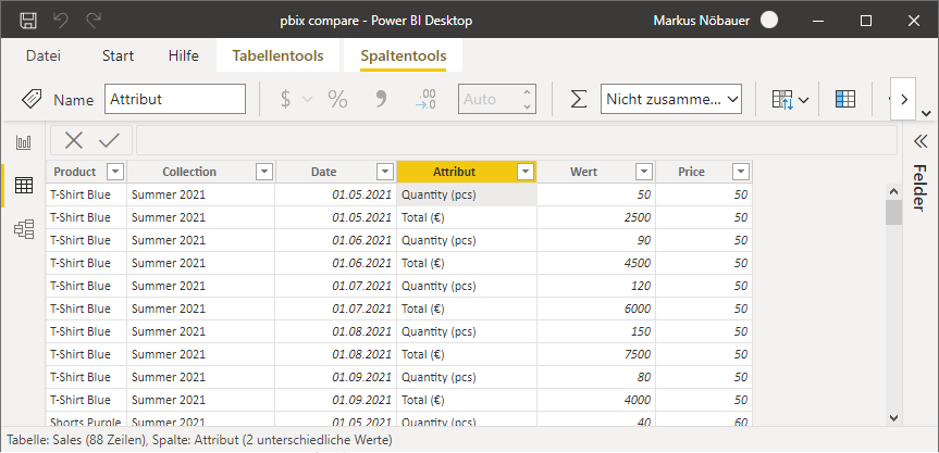
The original data contains 6 rows: The product, the corresponding collection, the sold quantity, the unit price, calculated total price (Qty * Price), date.
In order to make the Quantity and Totals available for a row-like visualization the original data was unpivoted. This created a new column called “Attribute” and another Column called “Value”. The unit (pcs, €) have been added to the attribute to make it more readable. The resulting data looks like the following in PowerBI:
Filter tables
To implement 2 independet filter options based on date and collection 4 independet tables have been added. A date table and a collection table for both filter options. The date tables can easily be generated by using the Calendar() function:
The collection tables are generated by using the Distinct() function on the collection column in the sales data table. Each of the tables contain a distinct list of collections available for filtering.
Filter1Collection = DISTINCT(Sales[Collection])
Filter2Collection = DISTINCT(Sales[Collection])
Measures
Three measures have been create. Two measures that sum up the Value column in the sales data filtered on the selected values in the Filter1* table or Filter2 table:
The third measure calculates the difference between the other two measures:
M_Diff = [M_Sum2]-[M_Sum1]
Visuals
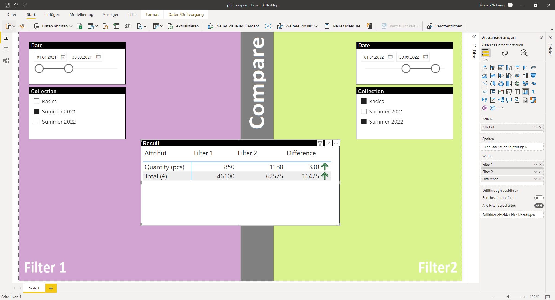
Finally the report contains 5 visuals. Two slicers for date and collection on the left, another two slicers for date and collection on the right, and a matrix in the middle. The matrix shows the Attribute column as row and shows M_Sum1, M_Sum2 and M_Diff as values.
For example comparing collection “Summer 2021” from 1. Jan. 2021 till 30. Sep. 2021 to the aggregated values of “Collection 2022” + “Basic Wear” from 1. Jan 2022 till 30. Sep. 2022.
Comparing quantity and totals from different time spans and products in one matrix
The slices on the left only affect the M_Sum1 measure which shows quantity and totals in the Filter1 column while the slicers on the right effect only M_Sum2 measure which shows the results in Filter2 column. The difference is calculate dynamically when adjusting the slicers.
PowerBI goals are used to keep track of targets like sales quantity, quality, etc. Goals can be linked to values from PowerBI reports. This video shows how to create a scorecard with goals based on Dynamics 365 Finance data.