Dataverse is the name of the Dynamics 365 Apps database (e.g. Sales, Service, Field Services, etc.). PowerBI desktop comes with a builtin Dataverse connector. However, if you have multiple environments not all of them may show up in the connector.
Dataverse environment missing in PowerBI connector
In order to make the environment visible in PowerBI Desktop Dataverse Connector you have to enable PowerBI Embedded in your environment.
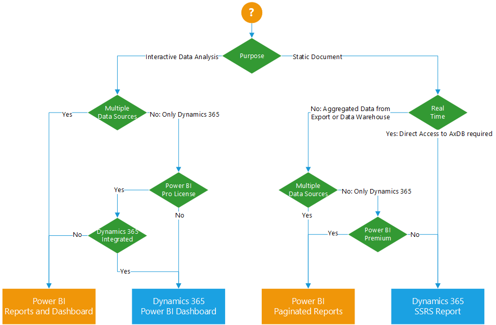
Dynamics 365 for Finance and Supply Chain Management offers a broad range of reporting and business intelligence options. You can utilize the integrated Power BI dashboards, link the Power BI report gallery within Dynamics, use integrated SSRS reports or develop Power BI reports and dashboards that connect to Dynamics 365. Sometimes it can be hard to decided which one to choose. Here is a guideline which one to choose depending on the reporting requirements.
Decision Tree for Power BI / Reporting in Dynamics 365 Finance & SCM
Report Format:
What is the purpose of the report? Is it an interactive report / dashboard or is it a static list or document like artifact? For example, sales analysis is typical an interactive report while a collection letter is a printed document. Power BI is great for interactive data analysis, SQL Server Reporting Services (SSRS) is the right tool for lists and page oriented printable documents.
Real Time:
Do you need to see transactional data as soon as it is generated in Dynamics? For example posting and invoice and immediately printing the document. If so, you need to access the transactional database (AxDB). There are two ways: Use integrated Reporting Services or query entities via OData. However, using entities allows you to access the AxDB but Power BI doesn’t support Direct Query mode for OData, i.e. you have to hit refresh in order to get the latest data.
Multiple data sources:
Is Dynamics 365 Finance the only data source for your report, or do you need to integrated external data sources as well? An example could be to develop a revenue analysis which includes actual sales data from Dynamics 365 as well as demographics and household income. Integrated Power BI dashboards in Dynamics 365 use direct query to access the AxDB and cannot integrate other data sources. It is also not recommended to load external data into Dynamics 365 AxDB because you have a limited cost free database size in your subscription. Additional SQL storage has to be paid.
Additional licenses:
Dynamics 365 Finance and Supply Chain Management includes the rights to view the integrated Power BI dashboards. No additional Power BI license is required. Reports developed using the integrated SQL Server Reporting Services technology are also covered by the Dynamics license. External Power BI reports, dashboards and paginated reports require additional Power BI licenses. At least Power BI Pro for reports and dashboards, Power BI Premium Capacity or Premium per User for paginated Reports.
Examples:
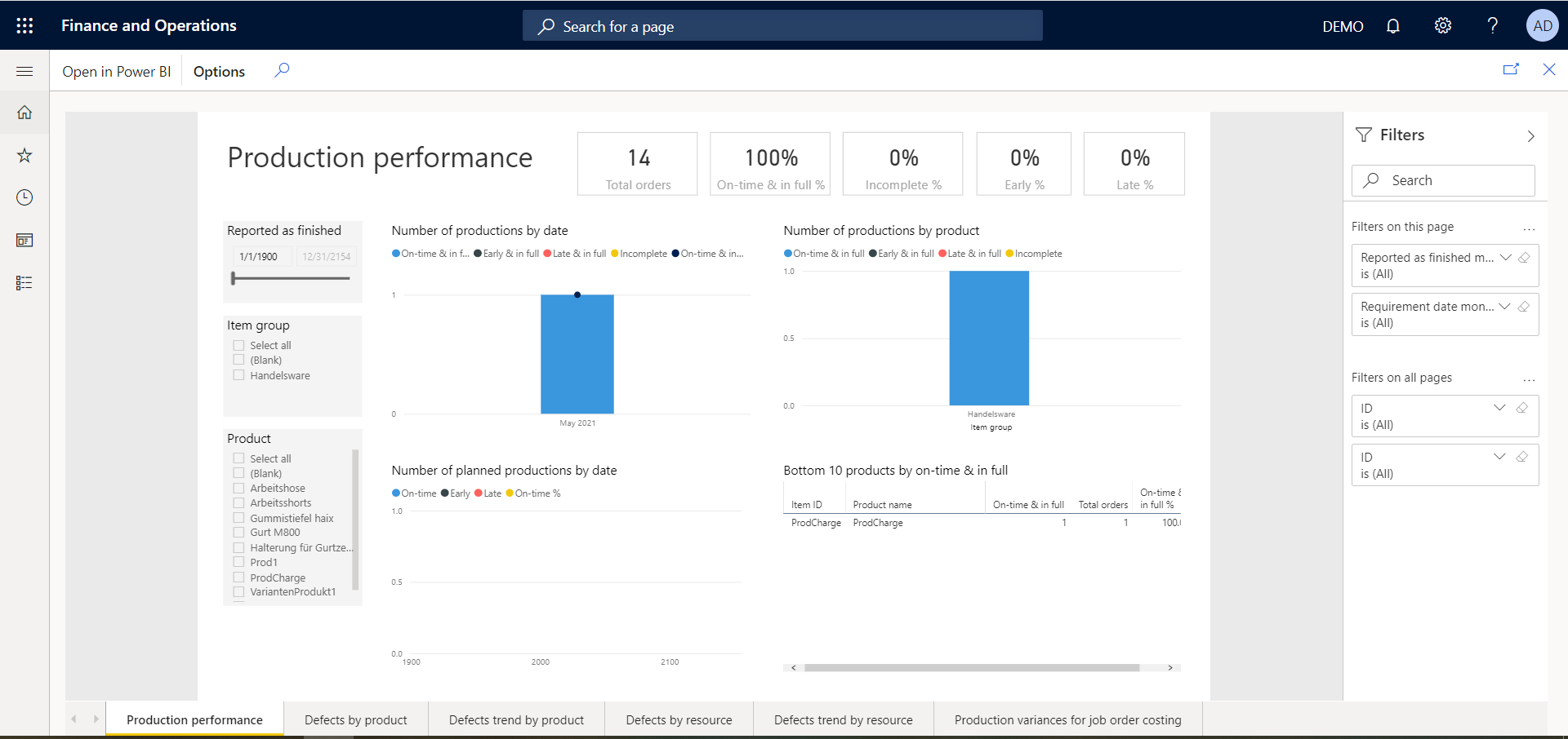
An interactive custom Power BI Report viewed in Dynamics 365 Finance via the users Report Catalog option
Production Performance is part of Dynamics 365 Finance & SCM and directly connects to the entity store (aka. AxDW)
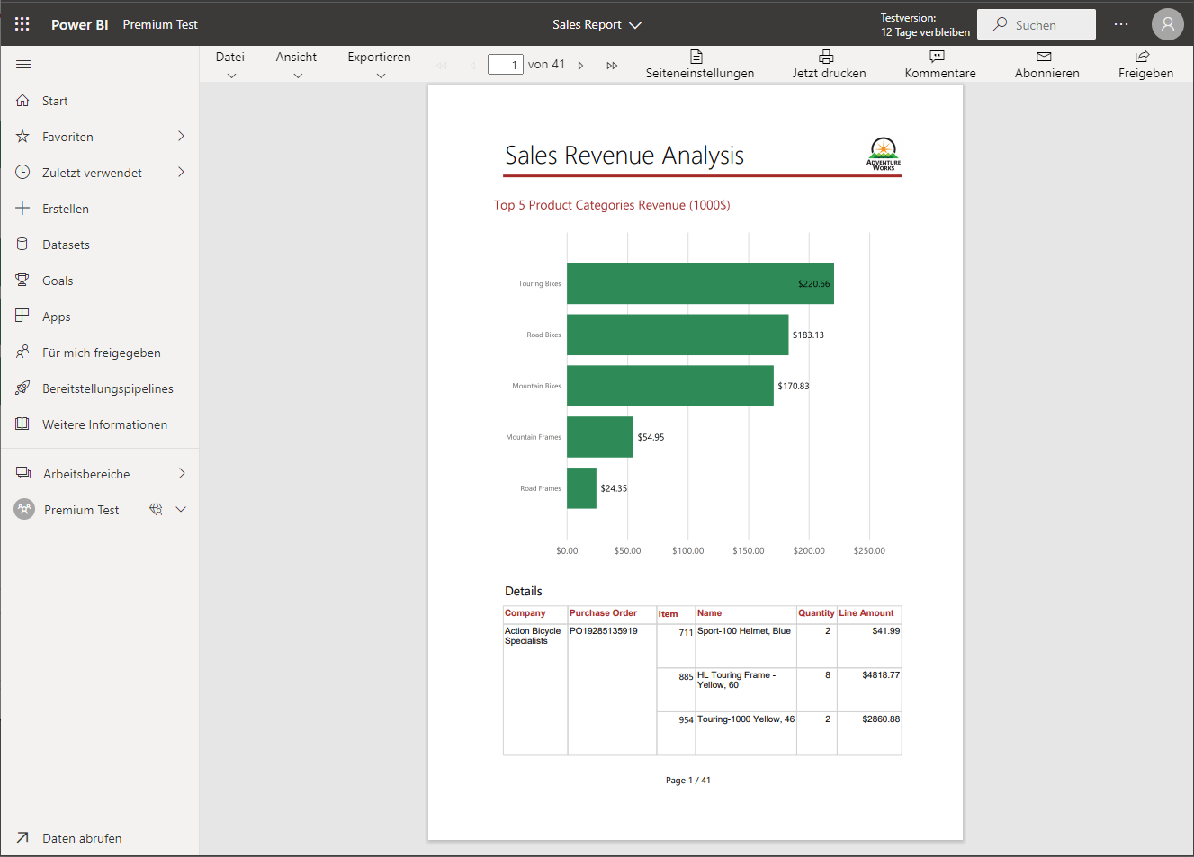
A paginated report in Power BI (Premium)
A static SSRS paginated report in Dynamics 365 Finance and SCM
Conclusion
Before you start working with a certain product, make sure to understand the requirements. Identify the data sources and how to access them. Then choose the right tool for the job. Don’t try to make a printable Power BI or fancy SSRS. By leveraging the full reporting and BI potential you can deliver a great user experience that adds value to Dynamics 365 Finance and SCM.
Power BI goes hand in hand with Dynamics 365 Finance and Supply Chain Management. By default Power BI can be used within workspaces and Dynamics 365 comes with a data warehouse and a large set of reports and dashboards. But wouldn’t it be nice to show Power BI visuals in common forms and filter on the active record? This can be done without coding by using Power Apps:
D365 Parameter to Power BI filter
Dynamics 365 Finance is capable to load Power Apps and pass parameters to the App, while Power Apps can load PowerBI reports and pass a filter to Power BI.
Create a Power BI report
Create a report that can be drilled down to the granularity you want to display in Dynamics 365 Finance. For example if you want to show customer specific information, your report should support filtering on a customer account.
For example I’m using the SalesInvoiceV2Lines and ReleasedProductsV2 entities. The SalesInvoiceV2Lines comes with a table reference to the SalesInvoiceHeaders where the invoice account is stored. The ReleasedProductsV2 can be linked to the lines via the product number.
Dynamics 365 Finance SalesInvoiceV2Lines entity in Power Query editor
Next create the desired visuals. For example a column chart for the revenue by Year and a donut chart for the revenue by product group. Add a filter and inspect the different results you would expect for differnt customers.
Revenue by Year and Product Group
Save and Publish the report. Open the report in Power BI Online and pin the two visuals on a new dashboard. Make sure to give the visuals on the dashboard a useful title and subtitle.
Power BI tiles on a dashboard
Power Apps
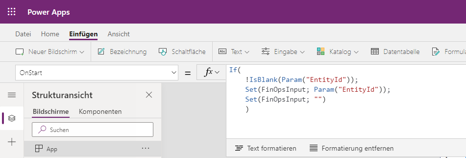
Everything comes together in Power Apps. Here the parameter from Dynamics 365 Finance is stored in a variable and passed as filter to Power BI. Open Power Apps via https://make.powerapps.com and create a new canvas app. I’d suggest to use the smart phone layout. According to the documentation add the following code to the OnLoad in Power Apps. This will store the parameter value from Dynamics to a Power Apps variable called FinOpsInput. (Depending on your local settings you may need to replace , with ; in PowerApps)
Read parameter from Dynamics 365 Finance in Power Apps
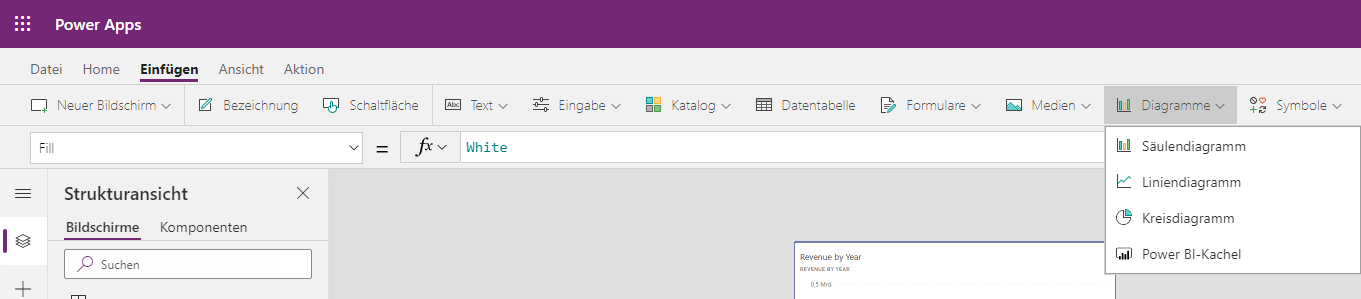
Next, add the Power BI tiles. From the ribbon go to Insert > Diagram > Power BI. Insert a Power BI tile to the empty screen. Choose your workspace, next the dashboard and finally the tile.
Insert a Power BI tile in Power Apps
The Power BI tile is referenced via an URL. This can be edited by selecting the Power BI tile and switch to Advanced. The syntax is:
&filter=TableName/FieldName eq 'YourValue'
Add a filter on the customer account with the values from the FinOpsInput variable as value. Make sure that the filter matches the field in your Power BI report. For example this would look like the following URL in my example:
Save and publish your App. From the list of your Apps, open the details page of your app and copy the App ID.
Power App DetailsCopy the App-ID from the details page
Add the Power App in Dynamics 365 Finance and Supply Chain
Logon to Dynamics 365 Finance and navigate to the screen where you want to display the Power BI tiles. In my example I’d choose Module Accounts Receivable > All Customers. In the upper right at the ribbon click on the Power App button and select add an App.
Add a Power App to Dynamics 365 Finance and Supply Chain Management
In the Add an app dialog provide a useful name. Paste the App-ID in the second field. From the context dropdown select the field to pass as parameter to Power Apps. In my case this would be the AccountNum. Finish by clicking on Insert.
Dynamics 365 Finance requires a reload of the page (F5). Test your Power App by selecting a record and the from the Power Apps button open the Power App. It will load the Power App and present the filtered Power BI tiles.
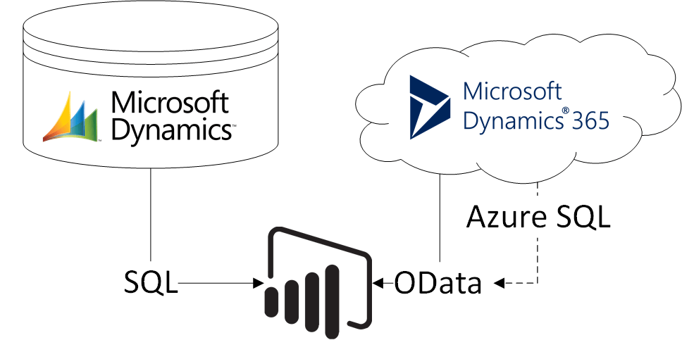
A common requirement during an ERP upgrade project (e.g. from AX 2012 to D365 Finance) and transition phase is to include both systems in the BI or reporting environment. Because of its tight integration with Dynamics, in many cases PowerBI is the preferred reporting and BI platform. PowerBI is capable to combine different data sources like OData feeds from D365 and SQL connections via gateway. However, for the person developing reports, it will become complicated to integrate cloud and on-prem datasources. For example, to create a sales report, one would need to include the Customers, SalesInvoiceHeader and SalesInvoiceLine entities as well as the CustTable, DirPartyTable, CustInvoiceJour and CustInvoiceTrans tables.
Different data sources in one PowerBI report
One way to address this issue can be to separate ETL logic from report design. PowerBI supports this approach by using dataflows. By using dataflows you can place PowerQuery logic direct in the Microsoft cloud and offer reuseable data artefacts. People designing reports simply connect to the dataflow but are not concerned with the ETL logic required to combine data from the old AX installation and a new Dynamics 365 ERP cloud environment.
Use PowerBI dataflow to decouple ETL logic from report design
Example
From PowerBI workspace create a new entity using dataflow. Choose the OData feed for Dynamics 365 and provide the URL for the CustomersV3 entity.
OData feed for entities from Dynamcis 365 Finance
Clicking next will open the Power Query editor and load the customers from Dynamics 365 Finance. Remove all the fields you don’t need in your application. In this example I’m using the DataAreaId, Account, Name, Group, Address and Delivery mode + terms.
PowerBI dataflow based on Dynamics 365 Finance OData CustomerV3 entity
For an on-premises AX 2012 installation you need to install a data gateway, so PowerBI can access the local SQL database. If you already have a gateway, create a new dataflow in PowerBI and use the SQL connection. I’d recommend to create a view on the database instead of loading tables in PowerBi.
CREATE VIEW [dbo].[PBIX_Customer] AS select DataAreaId, DirPartyTable.NAME, ACCOUNTNUM, CUSTGROUP, TAXGROUP, LogisticsPostaladdress.ADDRESS, DlvTerm, DLVMODE from CUSTTABLE join DIRPARTYTABLE on CUSTTABLE.PARTY = DIRPARTYTABLE.RECID join DIRPARTYLOCATION on DIRPARTYTABLE.RECID = DIRPARTYLOCATION.PARTY join LOGISTICSPOSTALADDRESS on DIRPARTYLOCATION.LOCATION = LOGISTICSPOSTALADDRESS.LOCATION where LOGISTICSPOSTALADDRESS.VALIDFROM <= GETDATE() and LOGISTICSPOSTALADDRESS.VALIDTO >= GETDATE() GO
Choose SQL Server data source for PowerBI dataflow
Select the data gateway and provide a user to access the database
Connect a PowerBI dataflow to your on-premises AX 2012 database using a gateway
Select the view and load the AX 2012 data to PowerBI. Save the dataflow
Dynamics AX 2012 customer data via data gateway
After you have created both dataflows return to your workspace, go to your dataflows and refresh both to load the data.
Refresh dataflow from Dynamics 365 Finance and Dynamics AX 2012
Next, create a third dataflow to combine the data from the Dynamics 365 Finance and AX dataflow. This time choose to link entities from the other dataflows:
Link PowerBI entities via dataflow
Select both dataflows
Select PowerBI dataflows to merge
In the Power Query Online editor rename the fields in both dataflow entities so you can append both queries. Be aware that Power Query is case sensitive and dataAreaId is not the same as DATAAREAID. When you have done this, append both queries as new one.
Append queries in PowerBI
From the new query make sure to remove duplicate customers
Remove duplicates in Power Query Online
If your have a PowerBI Pro but not a Premium subscription, deactivate load of the underlying queries.
Deable load when using PowerBI Pro
Save and refresh the dataflow. From the settings schedule the refresh and endorse the dataflow as “Promoted” or “Certified”. This is not necessary but it adds a label to dataflow and your report designer users see that they can trust the datasource. In PowerBI Desktop open Get-Data and choose PowerBI dataflow as data source:
Get data from PowerBI dataflow
Select the merged Customer data source.
Promoted and certified PowerBI dataflows
You can use the dataflows in your PowerBI datamodel but dont have to worry about the logic behind
Linked dataflow sources in a PowerBI data model
Conclusion
Using dataflows has some advantages. It helps you to decouple ETL logic from design logic. Especially when working with older versions of Dynamics AX you have to have deeper knowledge about the data structure. Another advantage is the reuse of dataflows. Typically you are not creating 1 single report, but more reports that require the same dimensions e.g. customers. By using dataflows you don’t need to maintain the load and merge in multiple PowerBI files.
A typical challenge in a BI project is to integrate data from different sources. For example files stored locally, ERP databases, cloud services, etc. On the other hand, PowerBI (desktop) is designed for power users to develop reports quickly. However, power users may have business knowledge but in most cases lack the technical knowledge to integrate all the data they need. With PowerBI dataflow it is possible to break the workload into a technical IT-related part and a business analysis part.
PowerBI dataflow hides the complexity of integrating differnt data sources, but provides an ready-to-use data source for PowerBI desktop. I’ve recorded a video how to integrate Excel expenses from a local folder with Dynamics 365 Sales customers and promote result as certified data source. The power user accesses this promoted data source in the report.
XYZ analysis is used to categorize products based on the variance of their demand. Products with a low demand variance, i.e. same quantity demanded regulary, are categorized with X, products with an unstable demand Y and products with a high variance in demand as Z.
The categorization is based on a calculated measure, often referred to as variance coeffizient. This coefficient is calculated by the standard deviation of the demand divided by the mean.
Video
Here is a video tutorial how to build the XYZ analysis in PowerBI
Example
Here is an example of three products with different demand over a year. Toilet paper is needed every month in the same quantity, car tires have a higher demand in spring and autum, firework is demanded only on special ocasions.
Demand of different productsDemand of different products in a year
Prepare Data in PowerBI
The basis of the XYZ analysis will be the SalesInvoiceLines entity. At least three columns are needed. The InvoiceDate, the InvoicedQuantity and the Product Name. In this example I renamed the dataset to “Demand”
In PowerQuery create two new columns, one for the year based on the InvoiceDate and one for the month, also based on the InvoiceDate. Afterwards remove the InvoiceDate column
YEAR  = Date.Year([InvoiceDate])
MONTH = Date.Month([InvoiceDate])
Next, remove the InvoiceDate column and group the records by ProductName, Year and Month and aggregate the InvoicedQuantity column. Here is an example:
Aggreage demand by product name, year and monthAggregation in PowerBI
The second dataset contains the XYZ data template, including the ProductName, Year and Month. For simplicity you can enter the 12 records for Year / Month combinations manually. Add an additional column containing the distinct list of ProductNames and expand the rows.
ProductName = List.Distinct(Demand[ProductName])
Product name, year and month
Finally, merge the two datasets to a new one using a left outer join based on the second dataset. As result you get a list of ProductName, Year, Month, Qty combination for each product and every month no matter if there was an acutal demand or not. If there was no demand, the Qty will be null and needs to be converted to 0.
Left Outer Join on calendar and demandMerge queries in PowerBI
The resulting dataset has records for eacht month and product. It can be used to calculated the mean, standard deviation and variation coefficient. To do so, create a new measure in PowerBI. It will calculate a coefficient value that can be used to categorize the products in X, Y and Z.
PowerBI and Cognitive Services are a powerful combination. A nice example is a tag cloud based on the key phrases in your daily emails. This example requires the following cloud components:
PowerBI (of course)
Cognitive Services for Key Phrase extraction
Exchange Online
Flow and Table Storage in Azure
Cloud Infrastructure
First, go to your Azure portal and create a new Cognitive Services Resource. In the creation wizard place the cognitive services to a data center near your Office subscription. I’d also recomend to creata a seperate resource group where you place all the services.
Cognitive Services in Azure
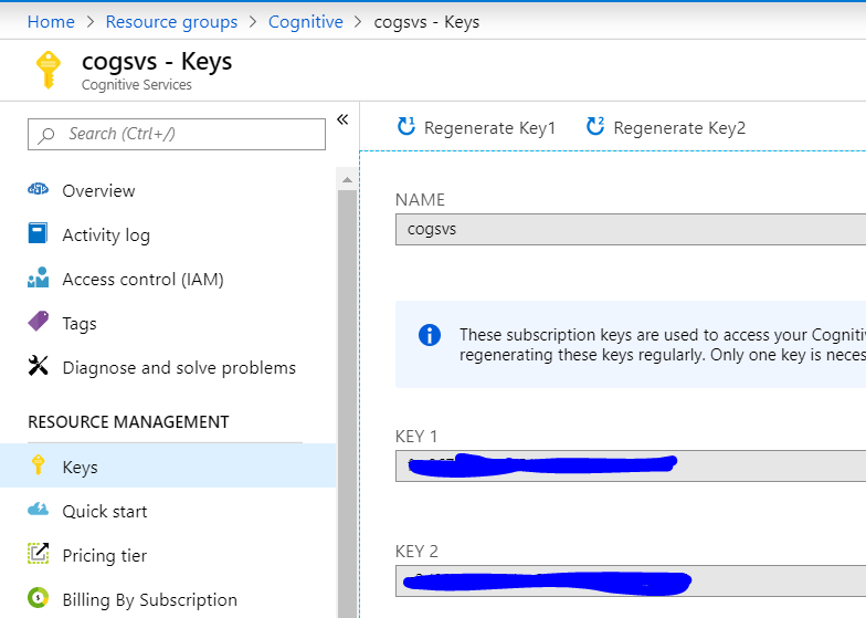
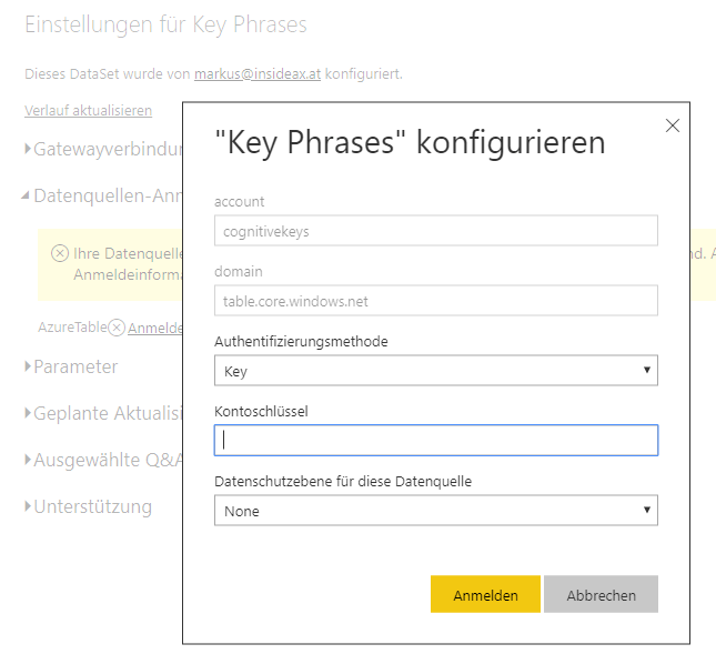
At the Cognitive Services Overview tab, copy the Endpoint URL. From the Cognitive Services > Key tab also copy the Key1. You need both to connecto to the cognitive services.
Azure Storage Account
Next create a new stroage account. Like in the Cognitive services place it in the same resource group and same data center. After the storage account has been created successfuly go to the overview tab.
Azure Table Storage
Select “Tables” and create a new table. Give it a useful name e.g. keystorage. A table storage can be used to place structured data, which require at least to fields a RowKey and a PartitionKey. It is up to you to provide meaningful values to theses fields when inserting data.
Copy the storage account name and from the Access Keys tab the Key1 value. You will need both to connect to the storage account.
Implement transformation pipeline in Flow (first naive approach)
Now, lets create the extraction logic using Flow. There are some limitations with this approach that will result in errors. A more stable version of the flow is discussed at the end. Go to https://flow.microsoft.com and create a new triggered flow from blank.
Automated Flow from Blank
The trigger for the flow is Outlook > When a new email arrives.
Because almost all my mails are HTML formated, I need to add the Content Conversion > HTML to Text step to remove the HTML code from the email body.
The third step in the flow is the key phrase extraction. Therefore add the Text Analysis > Key Phrase extraction step. There you need to provide the Cognitive Services Account Key and Endpoint. The text to analyze is the output from the HTML to Text step.
The last step writes the key phrases to the Azure Table Storage. Like in the Cognitive Services step, you have to provide the name and a key. From the Table dropdown select the table you have create earlier in the Azure portal. The entity has to be a JSON string. In my example the Partition is always 1 and the Row key is a Guid. Because, one mail will have more than one key phrase, the insert is encapsulated in an Apply-to-each block
Test your flow by sending an Email to your account. All the steps should succeed
Keyword Extraction Flow Test
You can use the Azure Storage Explorer in the Azure portal to lookup the phrases extracted from the email. In this example I sent an email from my company account, to my private mail account. The flow extracted the key words from the mail (Signature).
Azure Storage Explorer
Tag Cloud in PowerBI
In PowerBI add a new data source from the Azure Table storage. Again you need to provide the storage name and one of the keys. After connecting successfuly to the table, open the transformation window an take a look at the retrieved keys. You can remove the PartitionKey, RowKey and Timestamp from the data set.
Azure Table Storage in PowerBI
In the PowerBI report window, from the Visuals, klick on the Elipsis (…) and search for the Word Cloud in the marketplace. Add the Word Cloud Visual to PowerBI
Word Cloud Visual for PowerBI
Add the visual to the PowerBI report window. Set the Key Phrases as category in the visual.
Word Cloud in PowerBI Desktop
PowerBI Online Service and automated Refresh
Publish the PowerBI report to your workspace. Within PowerBI Online, go to your workspace and navigate to the dataset. From the Elipsis (…) open the settings page. Provide the Key for Azure Table storage.
Azure Table Storage Connection
Now you can also schedule the automatic refresh
Automatic Refresh from Azure Table Storage in PowerBI Online Services
Implement transformation pipline with a more stable Flow
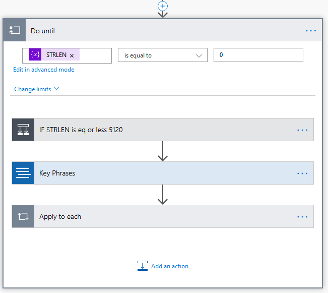
Unfortunatelly, the text processing in Cognitive Services is limited to 5120 characters. In many cases, Emails contain more characters than this and the flow will fail with an error from the Cognitive Services. One way to address this issue, is to implement a loop that cuts the Email body into pieces of 5120 characters or less before feeding it to Cognitive Services. However, Flow is not very developer focused and requires some workarounds for simple tasks like assigning function calls with a variable to itself e.g substring()
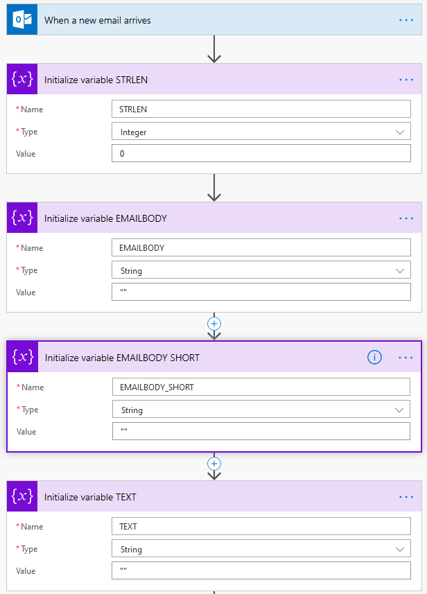
In the first place, delcare 4 variables
Some required variables in Flow
Next execute the HTML to Text block. An optimization is to use the Builtin Data-Operations action Compose to trim() the result to remove blanks from the start and end, and populate the STRLEN and EMAILBODY. Whereas the STRLEN requires a function: length(outputs(‘Trim_Text’))
Set the variables in Flow
Next, create a Do-While Loop from the Control elements in Flow. The condition for the Loop is STRLEN <= 0 because we are cutting the Email into pieces until nothing is left
A loop to cut the Email into pieces of 5120 characters (or less)
Within the Loop, create a IF decision depending on the STRLEN. If the STRLEN variable is less then 5120, the STRLEN is set to 0 to end the Loop. The variable TEXT is set to the EMAILBODY.
Email body is shorter than 5120
If the Emailbody is longer than 5120 characters, the first 5120 characters are copied to the TEXT variable: substring(variables(‘EMAILBODY’),0,5120)
Next the variable STRLEN is reduced by 5120: sub(length(variables(‘EMAILBODY’)),5120)
In the third step, the variable EMAILBODY_SHORT is set to the substring starting at 5121 till the end of the original EMAILBODY. Is is done, because Flow does not support variable asignment by a function that contains the variable itself: substring(variables(‘EMAILBODY’),5121,sub(variables(‘STRLEN’),1))
In the last step the orignial EMAILBODY variable is set to be the EMAILBODY_SHORT. It contains now the body without the first 5120 characters.
Email body is larger than 5120
Within the loop, after the IF condition, Cognitive Services are called with the TEXT variable and the results are written to the Azure Table Storage like in the first naive implementation.
Save Cognitive Services Results to Azure Table Storage
More Optimization
There are three additional ways to optimize this solution.
One may argue, that cutting the text into pieces might cut a releveant word for the Word Cloud into pieces and therefore cannot be recognized by Cognitive Services, e.g. Micros … oft. One way to address this is to modify the substring function, by checking the last index of “_” (Blank) and cut there.
Another issue is that Cognitive Services are not aware of all stop words. Especially if using Non-English Key Phrases you may end up with a messy cloud. However, there are public available lists of stopwords in certain languages out there, that can be loaded into PowerBI and used to exclude certain findings from Cognitive Services. The Word Cloud visual provides an Exclude property where you can provide stop words to exclude.
In the example from above, the language for Cognitive Services is set to DE (german). Howerver, this might not be optimal if you receive Emails in different languages. An optimzation could be to use Cognitive Service to detect the language, and switch the Key Phrase Detection Call for the most common languages in your Email inbox, in my case German and English.
Flow Download (package)
Please find the Flow Package in the Sources Onedrive Folder. Import the .zip File in your Flow Tenant. You need to map Outlook, Cognitive Services, Azure Table Storage, etc. to your configurations.
PowerBI dataflow performs ETL (Extract Transform Load) workloads in the cloud. PowerBI Pro and Premium Users get dataflow storage without additional charges. However, this storage is managed by PowerBI and you cannot access it directly. Therefor BYOSA (Bring Your Own Storage Account) is support to connect you own Azure storage account with PowerBI dataflow. I’ve made a video, following the documentation, how to connect an Azure storage account with PowerBI. Please find my video youtube:
Configure Azure Data Lake storage with PowerBI dataflow